My role
UX Research, Prototyping, UI Design Usability Tests, Information Architecture
Results
Decrease bounce rate in the campaign creation flow; Increased application‘s MAU and retention rate
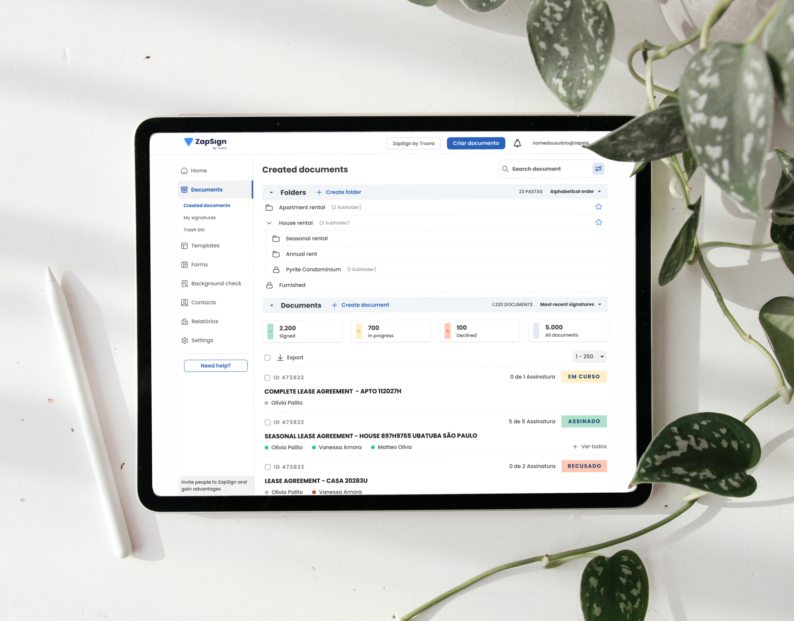
The Product - Digital Reef
Platform for audience segmentation, with features aimed at creating campaigns to impact mobile users, with marketing strategies using the data intelligence system. Although the service is very useful for specialized sales, its versatility often results in usability problems.
• Three months project time

Overview
DigitalReef is a company that emerged from the merger of three companies that used data intelligence to segment audiences. However, its functionalities were grouped without a clear strategy, resulting in constant errors in the configuration of the services offered.
These services include in-app campaigns, suggestions for downloading applications when purchasing a cell phone, creating journeys to impact the audience with surveys.
Tasks

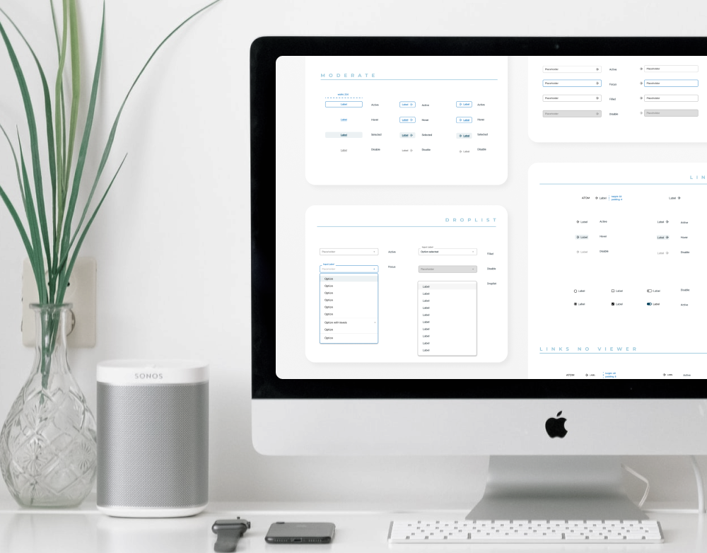
Design dimensions

Heuristic evaluate: Create Audience


suggestions:
- Center alignment and set rhythm on the page using white space
- Harmoniously distribute the elements across the interface
- Document and educate the user about the interface and fields to be filled in
Heuristic evaluate: Audience Segmentation


suggestions:
- Accordion to segment fill steps by similar fill themes and bring visual organization
- Avoid droplist, when possible present the options to the user
- Document and educate the user about the interface and fields to be filled in
Heuristic evaluate: Visual in-app Campaign


suggestions:
- Gestalt rules to organize UI elements and communicate visual harmony
- Merge Template + Content Editor steps into a single screen
- Information hierarchy through font size
- System allows advanced use of features, such as create more buttons
- Fixed scroll in creative content mockup
Heuristic evaluate: Schedule a Campaign


suggestions:
- Vertically aligned form entries
- Categorizing similar data in containers
- Use of different input formats to fill in data, when possible to maintain options
- Minimalist interface, no color variation to keep the focus on filling in the fields
- Brief instruction to the user on what data is needed to fill in each field
User flow for schedule a campaign

Usability tests

Interface improvements