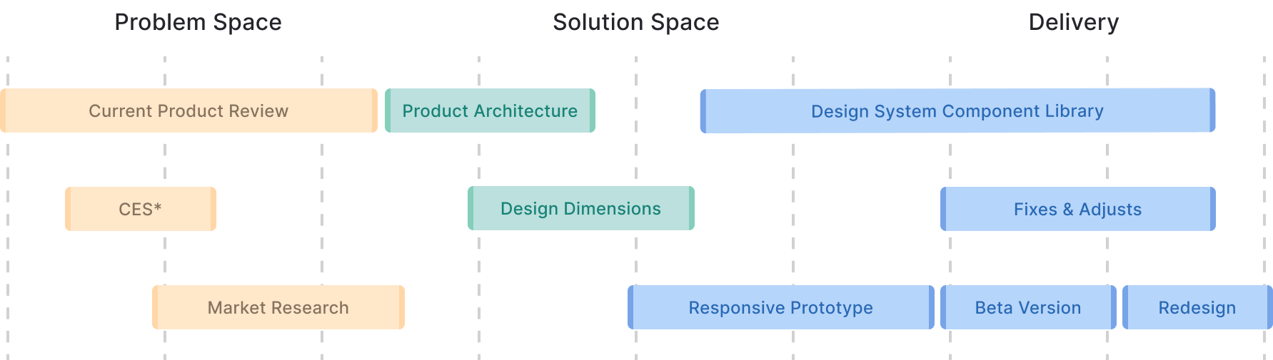
My role
UX Research, Prototyping, UI Design, Stakeholders Interviews, Usability Tests, Built and maintained a design system, Acted as Product Owner managed a small dev team
Results
Increase freemium user's conversion rate to subscribers; Reduce Churn Rate by providing a product that people enjoy using; Attract enterprise segment customers to increase average ticket and MMR.
The Product - ZapSign by Truora
Platform that offers the service of managing, creating and sending documents to collect digital signatures with legal validity. Operates under the SaaS model, with a base of 25 thousand active monthly users. Approximately 80% of this base consists of Self-Service Clients, which were crucial for the company's growth. However, there is the goal of expanding the reach to serve the Enterprise segment,
aiming to increase the average ticket and offer robust and personalized solutions to meet the specific demands of large corporations. This change involves redesigning the platform to improve usability and visual appeal, aiming to consolidate its position in the digital signature market.
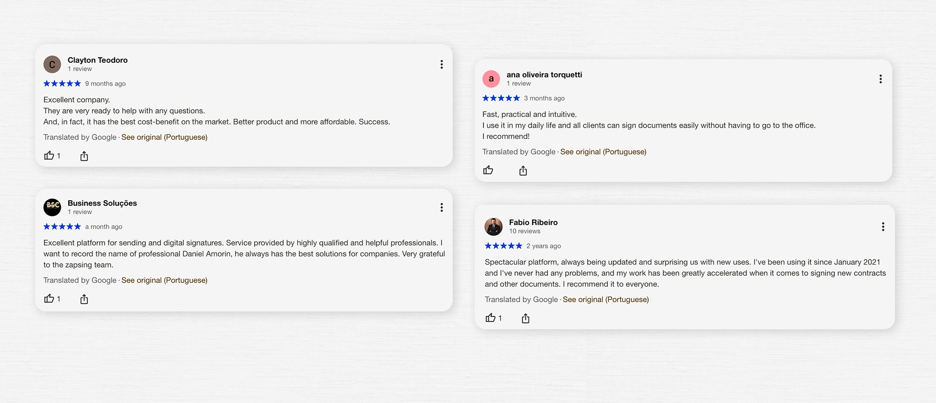
To start the project, we conducted a Customer Experience Survey (CES) to map the main pain points regarding the product.
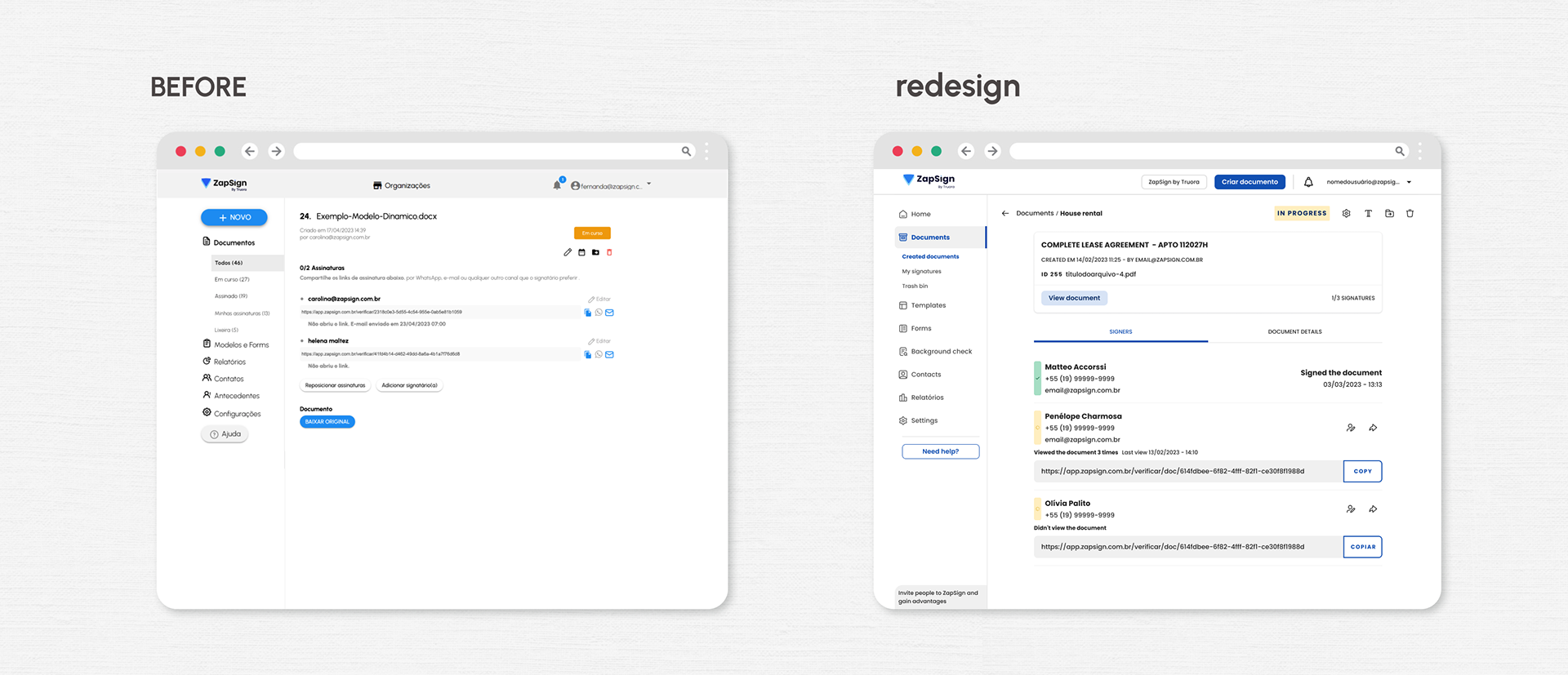
We found that the platform faced significant usability challenges in performing essential tasks such as creating and positioning a signature on the document, difficulty in adding signatories and sending the document via email, and confusion in searching for created documents and tracking their progress.
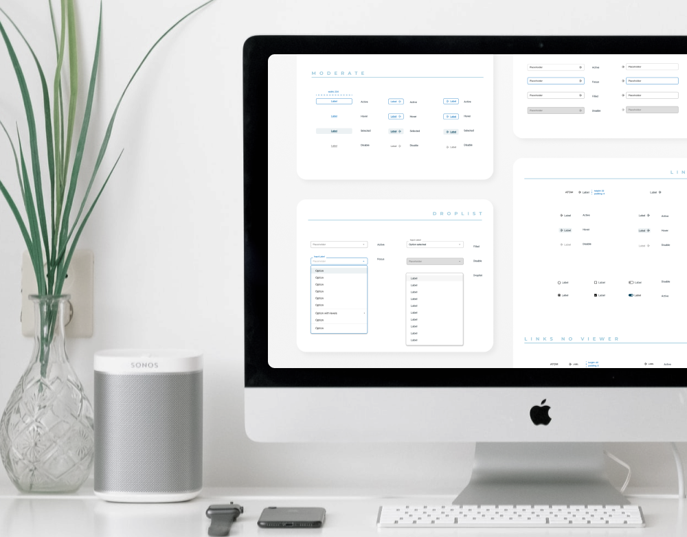
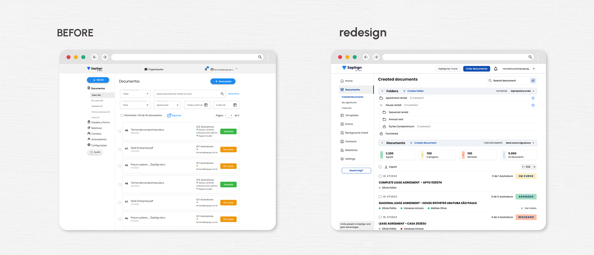
We also analyzed that the lack of visual consistency conveyed immaturity, affecting the product's credibility and user experience. Additionally, the interface resolution below the market standard at 980px limited the organization of visual elements and was compromising the platform's overall efficiency.
Performing the redesign is challenging because users are familiar with the current interface. Even with improvements, there will be a learning curve for users to adapt to the same features in the new interface.
I conducted interviews with users to identify pain points in usability and facilitated design workshops involving other areas such as customer support and sales teams to ensure alignment and provide an opportunity for the entire company to participate in the creation process of the new version of the product.
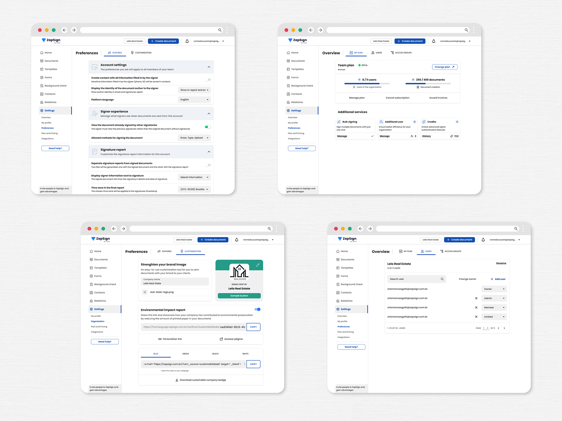
The product was designed with a focus on the desktop experience due to the extensive use of the platform on computers. However, I ensured responsive behavior following usability best practices for the mobile experience. I designed the document creation studio, that you can check out in this article:

It was crucial to encourage internal communication about the redesign process and involve the entire company to understand the importance of this change. This helped align all employees with the goal of improving the product and offering the best experience to users.
I had the opportunity to act as a Product Owner, leading 2 developers to redesign 80% of the product. I applied the feature flag launch strategy and communicated the beta version with a feedback form for users to participate in the changes and alleviate discomfort regarding the change, stimulating a positive reception of the redesign.
The beta version remained available for a maximum of two months in each section of the product. We provided the online form with the aim of reducing the demand on customer support during the transition period. You can check out my detailed experience in this article:
Product-Lead Growth is a strategic approach that develops the product to become the primary source of customer acquisition, retention, and expansion. Its goal is to create an exceptional product that solves real problems and provides an intuitive experience designed to effectively build trust and user loyalty.
Finally, the learnings: The discovery process occurred in evolutionary cycles where each stage of investigation added new information that refined the solution; Consistent visual identity ensured a cohesive and pleasant experience for users to perform their tasks autonomously.
The improvement in platform usability was evidenced by the decrease in user contact with customer support to understand how to use the platform; The design system was structured for the design and development team to work efficiently on component reuse for the interface.