Challenge
Unify fragmented visual ecosystems, eliminate technical misalignment between design and engineering, and eradicate chronic rework in product delivery.
My Approach
Creating and evolving scalable libraries based on Atomic Design principles and Design Tokens, combined with a complete restructuring of the handoff culture and documentation for QA and Engineering.
Business Impact
⚡ The Design System absorbed repetitive interface work, empowering designers to focus on what truly drives value: product strategy and journey architecture.
🛡️ Established a new technical documentation standard that reduces cross-functional misalignment and eliminates visual inconsistencies in production.
👥 Team Growth: Disseminated best practices and provided direct mentorship to designers, elevating the team's overall technical maturity.
An effective design system starts with the style guide and brand book—the foundation of the brand’s visual language. From there, the work involves mapping the visual patterns of the existing product and validating the accessibility of elements before scaling.
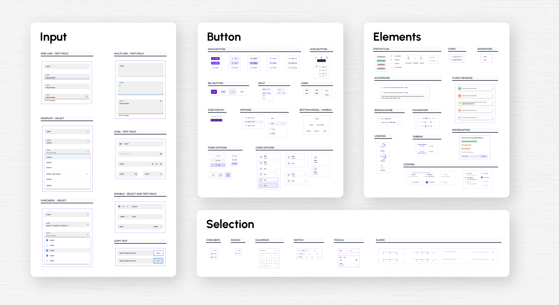
Components are built in Figma using variants and advanced properties, combining agility with visual consistency. The result is a living library, documented with behaviors, guidelines, usage examples, and technical specifications—creating a reliable source for designers and developers as the product grows.
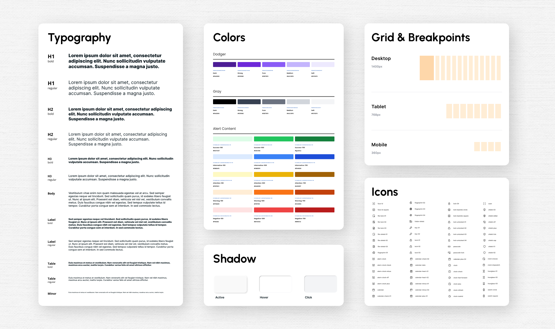
The design system was structured based on the Atomic Design methodology, organizing interface elements into layers—atoms, molecules, and organisms. This approach makes the component library scalable.

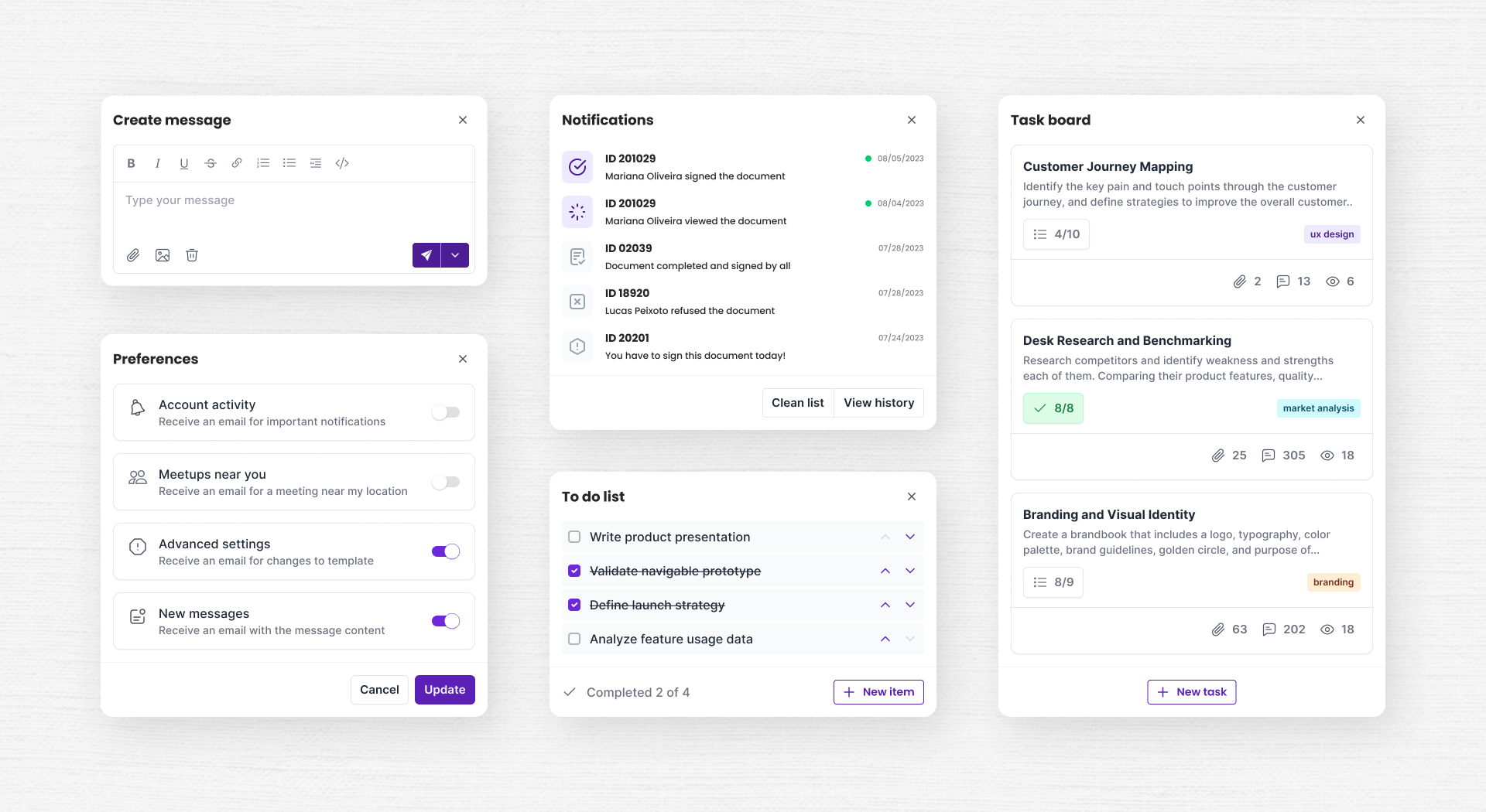
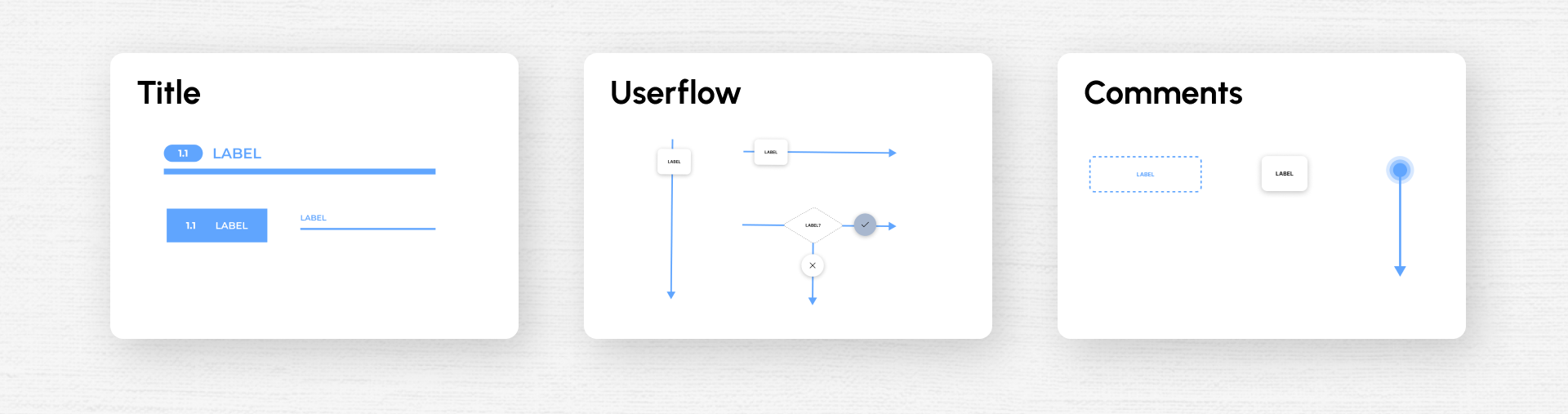
Handoff documentation is the bridge between design and development, and its quality eliminates ambiguity. To ensure developers have the autonomy to navigate and execute the project, I created a utility component library that standardizes the structure of deliverables in Figma—using titles, business rule indicators, organized flows, and contextual comments applied directly within the files for handoff.